REAP is a Internet of Things (IoT) platform for farming that automates weight record collection and aids in field operation management during harvest.
In an ever constricting commodity market, accurate yield tracking, USDA reporting, crop insurance, year-to-year analysis and harvest optimization are necessities of the modern farm. Scale-Tec’s REAP™ Harvest Inventory is a holistic platform designed to capture these critical elements in a single experience.
Scale-Tec designs, sells and services all types of weighing technology for use in the agriculture industry. This case study details my work to redesign the REAP iOS mobile app as part of a larger software development initiative.
UX Designer (1 of 2)
5 months
Sketch, InVision
Scale-Tec received feedback from customers and internal staff that REAP was challenging to use and struggled to support offline data collection stability. A facelift of the mobile app along with the consumer-facing web portal was incorporated into part of a larger effort to refactor the code to enhance system performance.
To improve the platform’s usability, our solution focused on the architectural structure of the web portal in order to offer more flexibility with the collected yield data and optimizing the mobile app to meet the needs of users in the field during harvest collection.
One of the insights gained from the user interviews was the existence of several different end-user types throughout the platform. These individuals interacted with REAP at various touch points and their roles often determined what type of functionality they typically used. These preliminary findings were cross-checked with internal stakeholders to formulate the following key audiences.
Works under contract for various farming organizations and may have several different jobs during a seasonal period.
Independent farmer who maintains a business of 1,500 to 3,000 acres of land and primarily works the field themselves or with a small group.
Larger operations composed of a mix of ownership stake and contract work. Seen as the business side of the farm.
As a result of our research, we noted 4 customer takeaways which I used to guide my redesign of the iOS app:
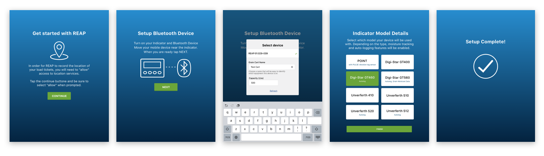
The current app allows too much control for operators and not enough for administrators.
UI elements are hard to tap on or see while outside/in a tractor.
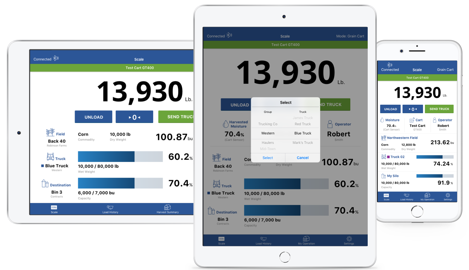
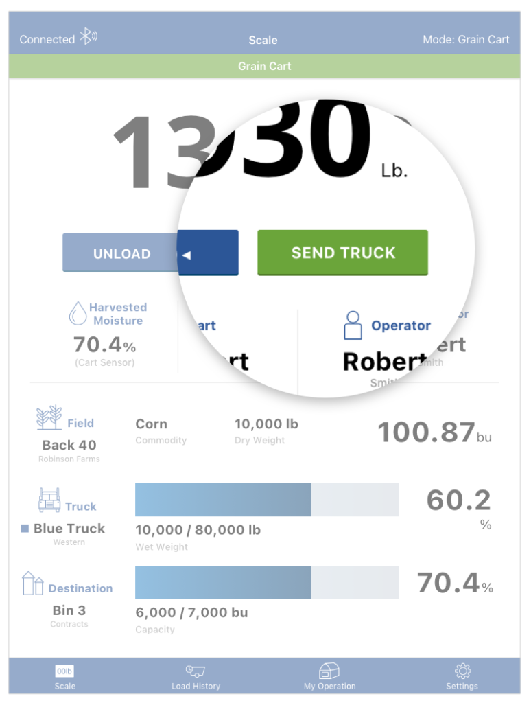
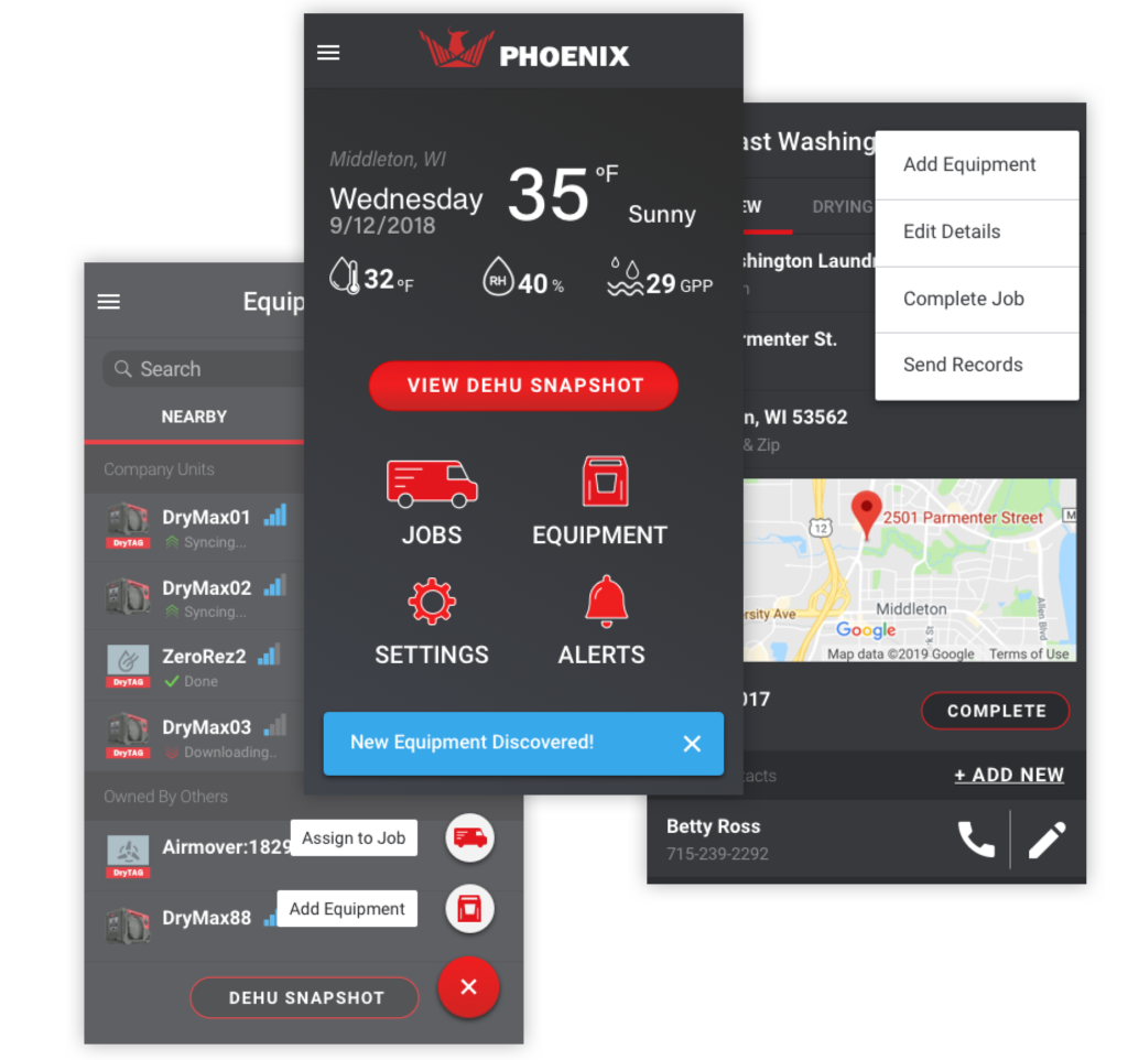
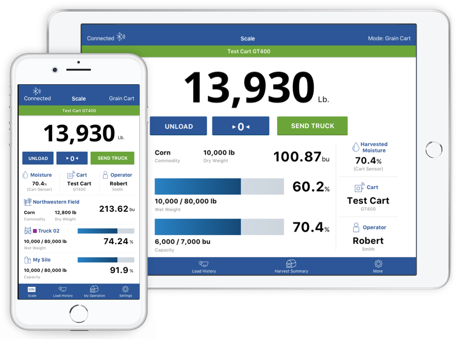
Sending trucks is a manual process, which can be forgotten and result in errors.
Users don't fully trust REAP to secure their yield weight data.
Along with these findings, we also wanted to ease the burden on Scale-Tec’s support staff who felt they spent too much time helping users configure the app to properly work with their equipment.
For the iOS app, many of the changes were based on best practice recommendations from Apple’s Human Interface Guidelines (HIG). Few preliminary sketches were created at the time based on the client’s direction to focus our efforts on the web portal, an area of the project that was being led by another member of my team.
We did collaborate in a design jam workshop to brainstorm and explore a few of our “Blue Sky” ideas. A few of the concepts considered were: a timeline-style feed of recent load tickets, a roles and permissions structure to grant access to REAP for hired harvesters for a limited time, aggregated harvest summary reports in the mobile app, and allowing users to manually create load tickets within the app for missed entries.
Some of these workshop ideas progressed to further design states, but ultimately, Scale-Tec opted to keep the functionality largely the same within the mobile app and focus on incremental UI changes. This decision was driven by their desire to have a new release ready for the next major harvest season in three months. As my colleague focused on the web portal, I quickly moved from wireframe to high fidelity concepts using the existing app colors along with incorporating branding elements used on Scale-Tec’s website.
For the high fidelity designs, it was important to ensure the layout would adapt to all devices and orientations. While in the cab of a tractor, the need for the large mounted tablet display would provide the largest viewing platform. However, when checking load records after a field has been harvested, users naturally wanted to grab their phone since it was close at hand.
The original implementation of REAP was poorly designed to accomodate changing orientations and device sizes. I created specific designs each scenario and interactive prototypes in InVision to ensure that our app developer would have extensive references and inspectable code. We also had bi-weekly touchpoints to review progress as the UI was built. This allowed me to participate in the QA process without creating a backlog of bug tickets to address at the end.
The primary app navigation was consolidated to bottom tabs. This gave better visibility to options for the administrator and quick return access to the scale screen for grain cart operator.
Behind the scenes, user permissions were built into the account system and those with administrator privileges could now adjust load ticket entries on the fly from the mobile app to capture any changes in the moment.
Perhaps the most noticeable change to the REAP app was the change to the dashboard. The background image was removed along with increased font sizes with higher contrast ratios. Relevant data and controls were also grouped to reduce the eye travel distance for users.
In the original app, changing a field required the user to navigate the settings menus and leave their main dashboard view. With the redesign, I worked with our developer to implement a customer picker dialog for the user to select the grower, farm, and field without leaving their place.
When setting up organization entities, I employed the navigation pattern utilized by iOS for nested menus rather than the previous dropdowns and radio selectors so users would be familiar with it. This also made development faster due to less custom code. Elements were displayed as cards to make them easier to tap.
To aid in proper use of the app by way of the “Send Truck” button, this object was moved directly under the scale weight display and grouped with other controls. Along with cues for when a truck reached capacity, users could also set visual reminders for specific percentages or weights based on the selected truck for added flexibility.
In order for farmers to trust the system, they needed to be confident that their load ticket data would be available and that they could review this information from the mobile app. The larger development requirement of the project was to ensure that as the app fluctuated between online and offline states, any collected load tickets would not be lost in the sync process.vTo further address this issue, the load history view was modified in the following ways:
Although there was not much change to architecture within the app, an area that was advocated for and ultimately added to REAP was an onboarding experience for new users. In speaking with Scale-Tec’s support team, we identified that an onboarding flow could reduce support calls and app confusion through:
Once the app was published, the difference in the 2018 harvest season was noticeable right away.
"REAP is doing very well, and your efforts over the last few months have done amazing things. I did not receive a single phone call this Labor Day weekend regarding REAP, its functionality, nor its setup. This is huge."
Nick Von Muenster, President of Scale-Tec
The redesign of the mobile app proved to be a successful effort. Not only did the changes reduce support calls, customers called to say that they liked the new interface as compared to the original.
As with all things, there were several areas of opportunity to improve the overall project outcome. The handoff of the web portal to development was upset with development team and designer staff changes leaving many decisions to be made on the fly. Combined with limited knowledge of the code base structure, the UX recommendations for the REAP portal were time-intensive to build. The design was eventually scaled back to a few small dashboard updates and better interactions with the data tables.
As I have become more familiar in UX for the Internet of Things, I now realize how siloed I had treated the app experience in relation to the web portal. While the audience and ways users interacted with these elements was different, by not questioning how the larger ecosystem operates, many area of value were left unexplored.
More projects
Website design and content © 2023 Melissa Easker