DryLINK
Designing the world’s first restoration app with Bluetooth connectivity to smart dehumidifiers.
- Hybrid Mobile App
Background
Known for manufacturing high-performance dehumidifiers and other water damage restoration equipment, Phoenix Restoration Equipment saw an opportunity to evolve the lowly workhorse dehumidifier to make it “smart” in order to meet the demands of today’s contractors. They sought to develop a commercial unit with Bluetooth capabilities and a mobile app.
The following case study reflects my work to develop and design the user experience for this app, which was then built using the cross-platform framework, Ionic, by the client’s development team.
Role
Lead UX Designer (1 of 3), Project Manager
Time
8 months
Tools
Sketch, Abstract. Lookback, InVision
Project Objective
Build an app for the professional restoration technician that makes work easier.
As an expert in manufacturing and drying technology, Phoenix Restoration’s parent company, Therma-Stor, needed insight from a firm dedicated to delivering internet-enabled devices and experiences. As part of my role with i3 Product Development, I was tasked with the challenge of understanding exactly what advantages an IoT dehumidifier could bring to this industry. My goal was to design a mobile app that leveraged those advantages alongside the launch of their first-of-its kind smart dehumidifier, the DryMAX XL.
Research & Discovery
Understanding the Problem
A Bluetooth-enabled dehumidifier promised a few key advantages. Time savings, improved accuracy, and simplified equipment tracking were some top-of-mind benefits that could transform the way restoration contractors did business. However, in order to develop a digital solution that was appealing enough to replace the pen and paper standard of the day, my team and I first set out to understand how restoration companies conducted business when it came to inventory management and job tracking.
The client team laid out the initial problem statement which we were to validate through the user research.
“Restoration professionals need a way to quickly and easily document drying logs at a job site so that they can submit accurate reports to insurance adjusters. The tool uses a bluetooth dehumidifier which needs to be simple since it is new.”
Contextual interviews combined with a online survey with several restoration companies helped to reveal just what a day-in the-life looked like for these pros. It also helped spark some useful features that I documented as user stories for the mobile app. Some of these key requirements are shown below.
- Fast and easy company equipment association
- Multiple permission levels for users
- A familiar data collection workflow
- Local weather data within the app
- Ability to control a dehumidifier remotely
- Capture historical activity of equipment on the job
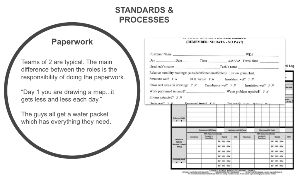
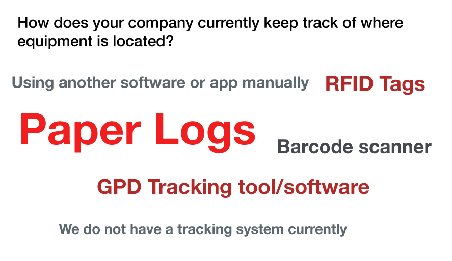
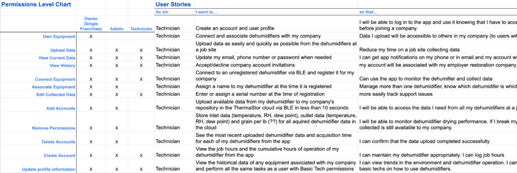
The notes from the interviews were mapped as an affinity diagram and highlighted some changes in priority for the app’s MVP launch. I presented the findings to our client along with the reframed problem statement as:
“Restoration pros have ways to quickly document logs at a job site. They need a connected tool that works with existing equipment and allows communication in ways that make sense to them. Bluetooth technology is not a new concept but Dry Max XL should be as simple to use as other, non-connected, equipment."
Once the entire project team was aligned, the focus of the mobile app became the management of company equipment, supporting non-connected equipment readings as well as those from the DryMAX XL, and surfacing additional benefits of the Bluetooth capabilities. At this point our team moved into early design stages.
Ideation
Developing a Solution
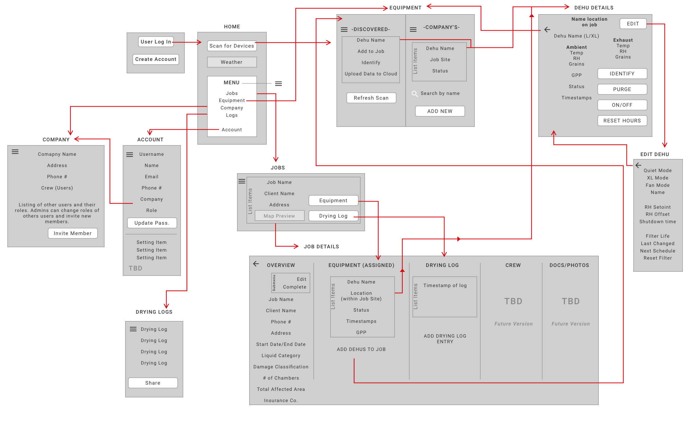
Information Architecture
To frame up the structure for the application, I developed an information architecture and sought approval from our client team before doing any visual design layouts. This document helped to deliberate on questions like “what is the flow of users through this app?” and “How is the information we are presenting helping the user drive decisions for their work?” Certain areas which were not part of the app MVP were considered in context of the overall navigation and wayfinding so as to naturally have a place in a future iteration of the product.
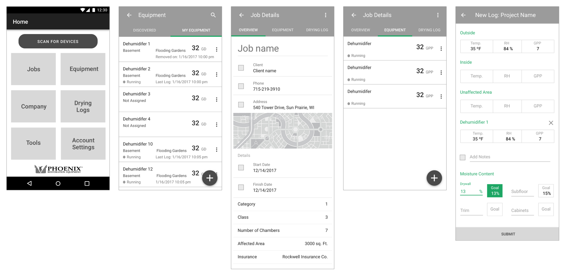
Wireframe Prototypes
In order to validate the design approach for the mobile app, we turned low-fidelity wireframes into a functional prototype experience to bring before usability testing participants.
Validation
Usability Testing
For usability testing, I worked with a teammate to facilitate the sessions remotely using Lookback as a testing tool. The prototypes were created in InVision and participants were asked to interact with them on their mobile devices just like they would if they were using the real app. Five individuals within the restoration contracting and education space were subjected several tasks to perform with the prototype to obtain quantitative findings. Metrics we evaluated included completion rate and time taken on a task.
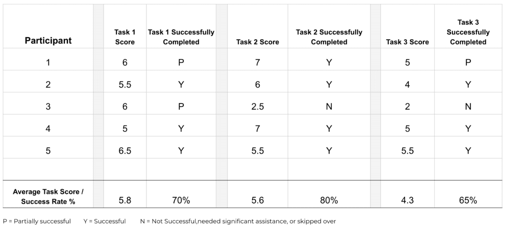
These data points would serve as a benchmark for any design changes over time to check if future iterations would outperform the predecessor. Along with the task analysis, we asked qualitative questions to gauge the response to the design at this stage. The feedback helped to refine some early ideas for app features including:
- Retooling the weather widget to focus on rain and humidity conditions for that day in a service
- Users need to be able to further define job parameters by adding rooms and chambers of affected wet areas.
- Buttons and actions needed to be apparent and obvious. A minimalistic design pattern was not the right approach for this audience.
- Users want to be able to edit data even if it was populated automatically by a connected dehumidifier. This sense of control would make them feel more comfortable trusting the technology.
By performing this validation research with design concepts that were easy to modify, we saved time for our client’s development team and provided useful information to take into product roadmapping discussions.
Development
Design System & Final Designs
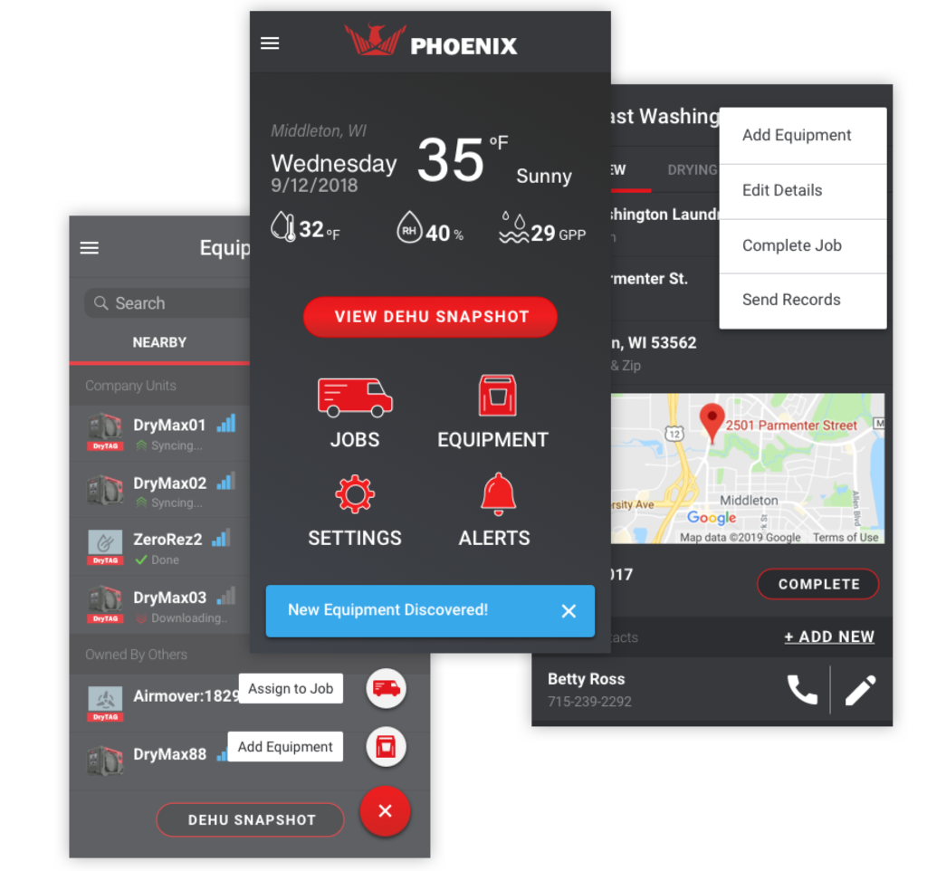
To ensure that design patterns and components were used consistently throughout the product, I set up UI guidelines to aid in our client’s understanding of how to incorporate the design specifications. The dark theme aligned with a larger redesign of Phoenix Restoration Equipment brand and marketing collateral.


Outcome
Positive Business Impacts
The final design of the DryLINK app included many of the initial ideas from the Therma-Stor project team. But, the value of real user feedback surfaced some features that now are cornerstones of the app’s success.
Since the launch of DryLINK in 2018, The platform has acquired more than 6,000 app users and has driven sales of over 8,000 Bluetooth enabled devices for Therma-Stor.
I have continued to work with Therma-Stor and Phoenix Restoration Equipment on the DryLINK product as the connected ecosystem continues to grow. Some of my contributions since the MVP release include a usability review and UI update in 2019, support for DryTAG Bluetooth beacons to track non-connected equipment as well as DrySENSE moisture content meters in 2020, and in 2021 the design of a companion web portal for greater visibility into inventory management.
Learn more about DryLINK from the Phoenix Restoration Equipment website.
More projects


