Watchdog EX
A cloud-based vivarium management system dedicated to protecting animal health, improving productivity, and assisting with regulatory compliance in research applications.
- Responsive Web Portal
Background
Precise environmental control is vital for research involving animal subjects. Researchers rely on holding facilities, known as vivariums, to ensure healthy conditions for animals over the course of a study. Avidity Science is a global manufacturer of water purification systems and laboratory equipment, including vivariums, for scientific research and healthcare lab facilities.
I acted as the lead UX designer during the course of this project and was responsible for all phases from research & discovery through developer hand-off and ongoing support.
Role
UX Designer (1 of 3)
Time
18 months
Tools
Sketch, InVision, Abstract, Whimsical, UsabilityHub
Challenge
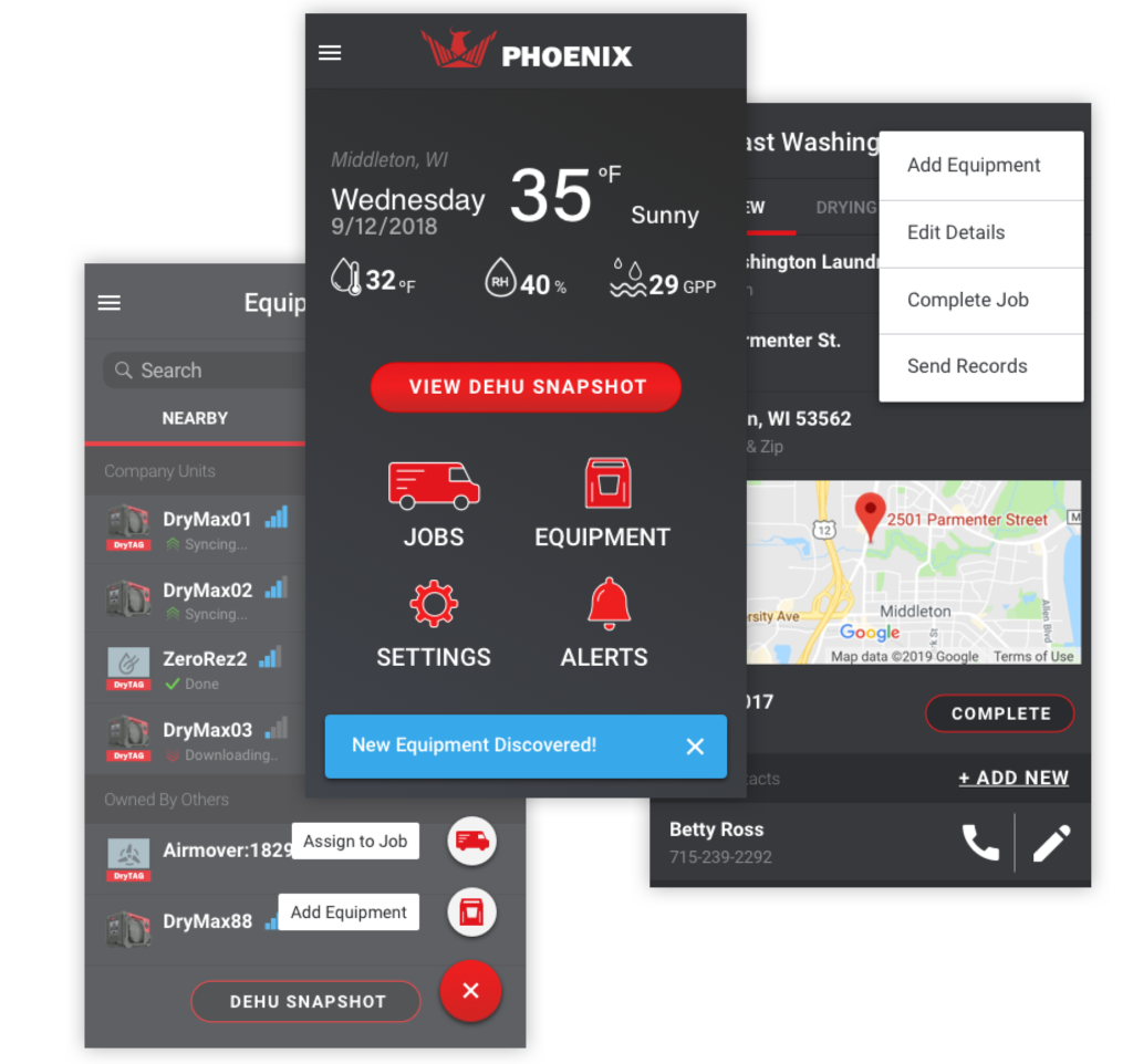
The origins of what would become known as Watchdog EX began back in the 1980’s with the original Watchdog System. This system was comprised of Local Processor (LP) units that tied all of the Watchdog functions together at each animal room with sensor modules for monitoring specific environmental conditions. The software ran on a local network connection and access for users was configured through dedicated servers and VPNs. As the platform aged, this technology was becoming obsolete and would be unsupported in many hardware systems within the next 5 years.
Our client, Avidity Science, internally designed and built a new system to replace Watchdog named “Pulse CMC.” It promised more flexibility and ease of access as an internet-enabled solution. The was just one problem:
Customers would not convert to it.
Avidity Science, known at the time as Edstrom Industries, consulted with i3 Product Development to start over and build a new product. My team was tasked with building a cloud-based solution to bring the strengths of the original Watchdog System into the modern era. The new solution had to support the hardware from both the first and second generation monitoring products and deliver a user experience that made up for previous shortcomings of Pulse CMC.
As the primary UX designer my job was to find out why existing customers would not upgrade to the Pulse CMC solution and identify what type of experience would make them willing to transition to the new platform our firm was developing.
Research & Discovery
Understanding the Problem
One of the challenges I faced with this project is the niche nature of users for this type of system. It was difficult meet with real customers of the existing Watchdog and Pulse CMC systems due to the sensitive nature of medical research and perception around animal testing. The user research methods chosen during the discovery phase reflect these factors.
Qualitative Interviews
Starting at discovery, we began by conducting stakeholder interviews with 6 members from the client team as domain experts and 2 existing customers to learn about the current state of Watchdog and Pulse CMC.
The environment in which research lab specialists work has its own unique context and circumstances. These conversations set me up with a better frame of reference for their needs and better understand the problem space. It was also an opportunity to learn about the concerns of the rest of the project team and how to prioritize the internal feedback we received.
Insight Findings:
- Monitored assets may be spread across multiple rooms and buildings.
- There is a tendency for people to leave in the middle of a process. They get pulled away by other duties.
- There are different users within the same system. One is more “reactive”
- The sensors and hardware perform as expected and are very reliable.
Heuristic Evaluation
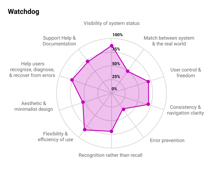
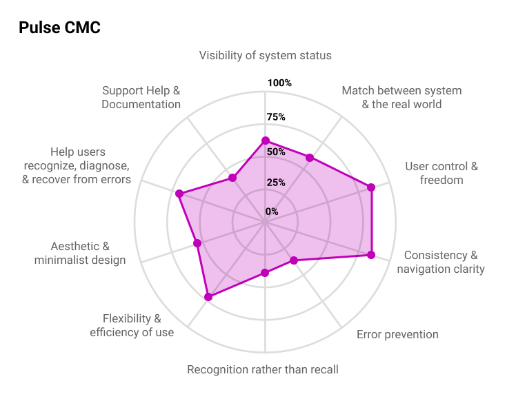
Along with another colleague, I performed a Heuristic Evaluation against the current Pulse CMC and Watchdog products. We conducted our assessment using Jakob Nielsen’s 10 Usability Heuristic principles.
The most common violated principles:
- Error Prevention
- Match Between System and Real World
Competitive Analysis
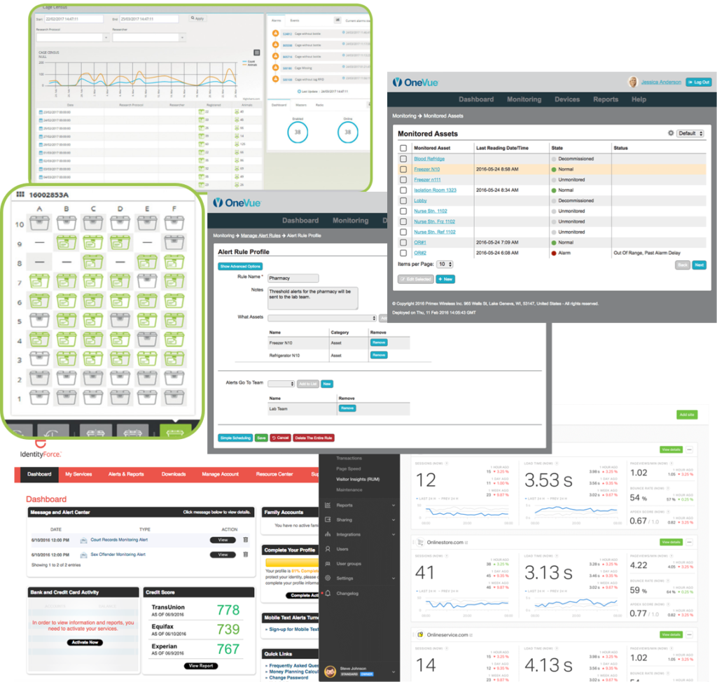
I conducted a study of other vivarium monitoring solutions in a competitive analysis.
This process shed light on similar features which existed in other SaaS platforms, including website uptime monitoring, building automation, and identity theft protection.
Problem Definition
Reviewing Our Findings
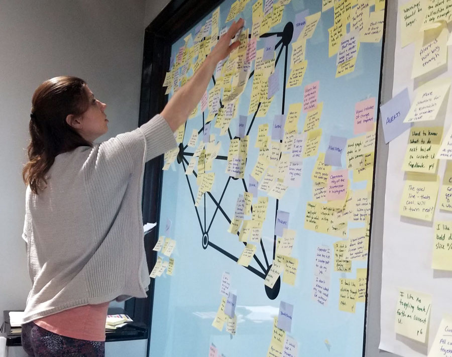
Affinity Mapping
Identifying User Archetypes
From our interviews, we learned there were two main types of users across both Watchdog and Pulse CMC: Researchers and Facilities Managers. Our internal stakeholders identified these roles, and the customers echoed this sentiment. Archetypes were created to visualize their goals, behaviors, and pain points.
Along with the existing user types, we identified a need for a third type who acted as a Department Manager. Their goals would be similar to that of the Facilities Manager but on a smaller scale – limited to rooms and assets within their own department.

How Might We...
How might we develop vivarium monitoring software that users are confident in entrusting their research data to.
Leverage Mobile Technologies
Allow for access to the system across mobile devices, tablets, and larger workstations.
User roles and permissions.
Surface content and functions relevant to that user’s role. Avoid unnecessary roles in order to limit accidental functional changes.
Prevent Cognitive Overload
Most users simply need to know what is wrong and how to resolve it. All other tasks should be reserved for those with admin privileges.
Settings in Context
Keep users contained within a view for most actions (alarming, user preferences, reports, etc.)
Provide system feedback
Load times, errors, and system navigation should be explained and displayed when possible. It should be easy to find support documentation to solve a problem.
Design and visual cues
Icons, color, and language should reflect current user expectations in order to aid in adoption and understanding of the product.
Design & Develop
Creating Solutions
Based on the above statement, I began working towards incorporating these definitions into potential solutions through multiple rounds of feedback from the client team. Initial concepts began with sketches and progressed in fidelity, with each iteration leading up to high-fidelity wireframes with limited use of color for usability testing purposes.
In parallel, the development team and I worked with the client to determine a user roles and permissions structure that would meet the needs of the archetypes that were identified.


Prototyping &Testing
The scenarios examined during usability testing centered around viewing the monitored assets in a location, responding to a triggered alarm, and setting up the alerting rules. Some static screen views were also shown with regard to user management.
Due to limited opportunities to interact with our client’s actual user base, we performed testing using a combination of remote moderated tests with internal stakeholders + non-project team members and an unmoderated test using UsabilityHub as a recruitment tool. Prompts and presented designs were segmented into those applicable to an administrator and those for the researcher roles.
Testing Takeaways
- Dashboard should focus on tending to alarms and present information that supports users doing this task.
- The idea of “Favorite Locations” was not useful when what users wanted to really know were “which locations have the most issues”.
- Seeing the system as a whole is equally important to contextual details.
- Users struggled to retain the necessary information when moving between views for monitored points and facility locations. Explore ways to combine functionalities.
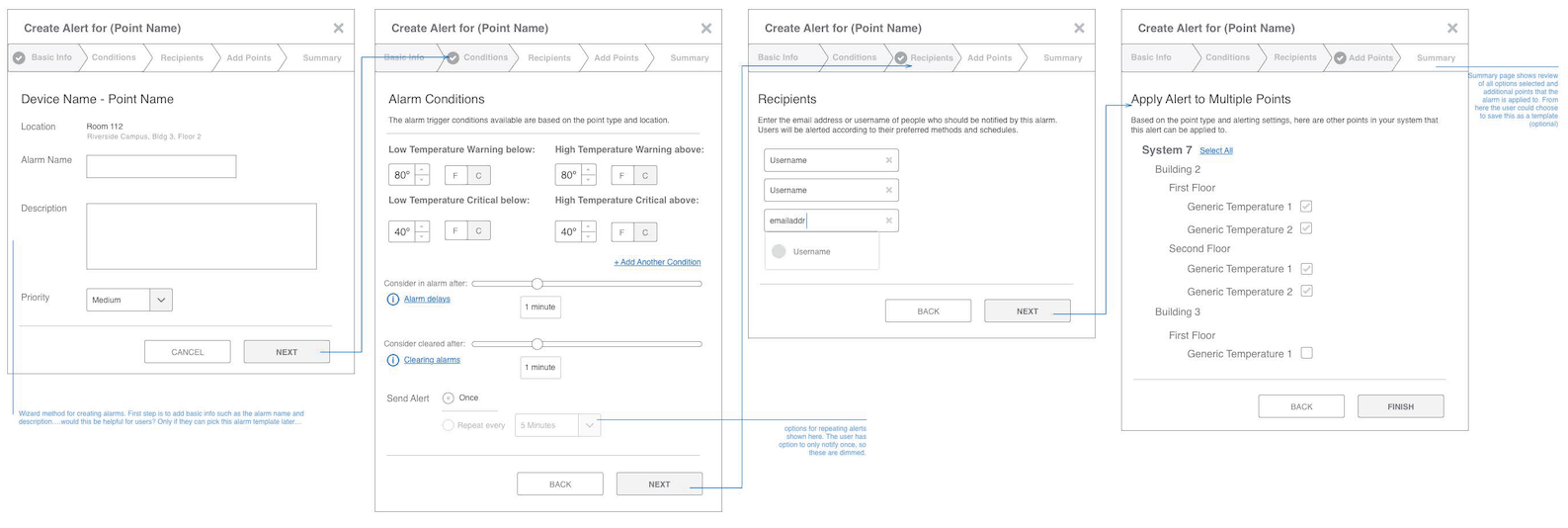
- Participants preferred an alarm creation method that was broken into multiple steps using a wizard.
- The room detail view was neat and organized and users appreciated the clarity in which they could see what data points were being monitored and the types of systems in place.
- The inclusion of introductory text and descriptive language was understood to be helpful but users tended to scan over this information and miss it.
- Language plays an important role in perceptions of urgency. The difference between “Alarm” and “Alert” created different emotional responses and would influence the confidence felt while tending to them.


Deliver
Assessing Design Impact
UI Design
I worked with the client’s marketing team to develop a new visual language for Watchdog EX. At the time, the business was still operating as Edstrom Industries, but they wanted to shift the product towards an identity which aligned with Triple Red, a company they had acquired in 2017. They would also assume a new company name, Avidity Sciences.

I used Style Tiles to help define the visual style of the new platform. After the initial set of three options were presented, I worked to refine and produce the UI components for the final product.
Our internal development team would be using Angular as the client-side framework. To optimize the build, I adapted the style to align with components available within the Angular Material library.
Raising The Red Flag
From usability testing, we learned that a crucial aspect of the platform was the ability for users to view the details of a location while still seeing the system as a whole. The initial concept did not do this well and was a focus of iteration efforts.
The revised concept received some positive reception from the client, but the amount of explanation necessary to communicate the functionality troubled me. I raised the red flag and requested more time and budget to explore another solution. Avidity Science was not thrilled with returning to the drawing board but recognized the unmet need that was still not fully realized. In order to prioritize essential and necessary work in other aspects of the project, I had to forgo additional formalized usability testing with this modified solution.
Talk about a gut check.
I was inspired by a design pattern used by LinkedIn, where a list of jobs would remain in view while displaying the detailed job description on the same page. This idea led to the rework of locations and room details being combined into a single page. While I only had internal feedback and design reviews to guide me, I could tell that this presentation hit home.
During my informal guerilla testing, my internal team commented that they could see that there were XX number of critical issues right away and could easily locate where they were in context of the other units. When presented to the client, it was much easier to describe how to interact with the page

Final Designs
High fidelity mockups for the final designs were created in Sketch and then imported into Invision as a prototype of the whole platform to allow the engineers to interact with the file and inspect code.
I worked closely with the front-end developer to ensure that the interactions felt consistent throughout the interface and to spec out anything that was missing along the way.
Dashboard
The dashboard is the main view for all user roles and emphasises any alerts and taking actions on them. Administrator roles can customize a set of quick actions that appear on the dashboard to make repeated quicker.
Locations
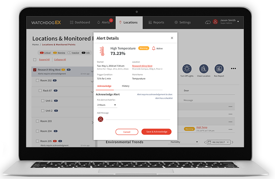
Locations provide an overview of the system spread across multiple buildings, wings, rooms, and cage racks. Filters enable users to focus on critical assets that require immediate attention. The details of a location contain additional controls and historical trends regarding that space based on the sensors enabled. Administrators can see who has access to a particular location and set access rules to ensure data integrity.

Alerting Rules
Creating an alert happens in a modal window with focused steps to keep cognitive strain to a minimum. Throughout the interface are information icons which reveal tool tips and links to more robust documentation. This pattern has been used on report generation setup scenarios as well.

Schedules
Within the research rooms were automated watering units and lighting. These could be programmed within Watchdog EX to operate on any number of schedules to correspond with the needs of the research study. When a location with lighting or watering units is viewed, the user can see details of the schedule and edit it or replace it with an existing one much as a template might act. However, pre-configuring and applying a schedule template was not required. The use of the word “Template” was ultimately removed throughout the interface due to the negative connotations it implied to Pulse CMC users.

Mobile Experience
The web interface can be viewed from a mobile device in a fully responsive experience. Certain advanced functions such as generating reports and setting up schedules were limited in the mobile view at the time of product launch with plans to incorporate these features in the product roadmap.

Throughout the course of this project, I was assisted by 2 other UX designers; specifically while conducting qualitative interviews and affinity mapping in order to come to the guiding problem statement. The Watchdog EX platform is able to generate comprehensive reports for research documentation and auditing purposes. The look of these reports on the web and in their printed format were designed by another colleague.
Takeaways
Lessons Learned
This project demonstrated the importance of having a dedicated project manager to coordinate parties to work together and track time and budgets. At the time, this was one of my team’s larger client efforts and user interface was only a small portion of a much larger cross-departmental effort to reverse engineer a programming language that was nearly 30 years old. There are some lessons that I learned through the whole design and development experience. Here are my biggest takeaways:
Stakeholder engagement is crucial across all team members. It is a misconception that only certain roles in the team need to engage with the stakeholders. The relationship with the stakeholders is key to develop trust to speed up the design and development processes. Each stakeholder has a different definition of what success is, which means they could be the potential source of risk and opportunity within the project.
UX copywriting is to be prized, not pushed off. One area identified in the redesign was the need for sufficient help and support documentation in the system. My own team’s resource constraints and our client’s area of expertise didn’t properly account for the amount of writing and editing this would entail and thus the inclusion of design elements for tooltips, introductory text blocks, and a support system knowledge base was largely unpopulated at the time of production launch.
Set metrics for success across qualitative, quantitative and data analytic sources. The private nature of the industry and distance at which my team was held from the core of our client’s business limited our ability to track and measure the success of the new system. No real plan was set forth at the project onset to quantify a means of meeting project goals beyond stated deliverables. In the years to follow, this became a black hole of unknowns in terms of assessing UX decisions.
Along with these learnings, I did receive some positive feedback after project wrap-up and final code hand-off.
"So far, so good with the WatchdogEX system! We have plenty of customers already using the site and many more in queue. We are still learning, but it has come a long way. We get compliments all the time on the UI that Melissa helped design..."
Andrew Gregas, Software Engineering Manager - Avidity Science
More projects
Scale-Tec REAP
